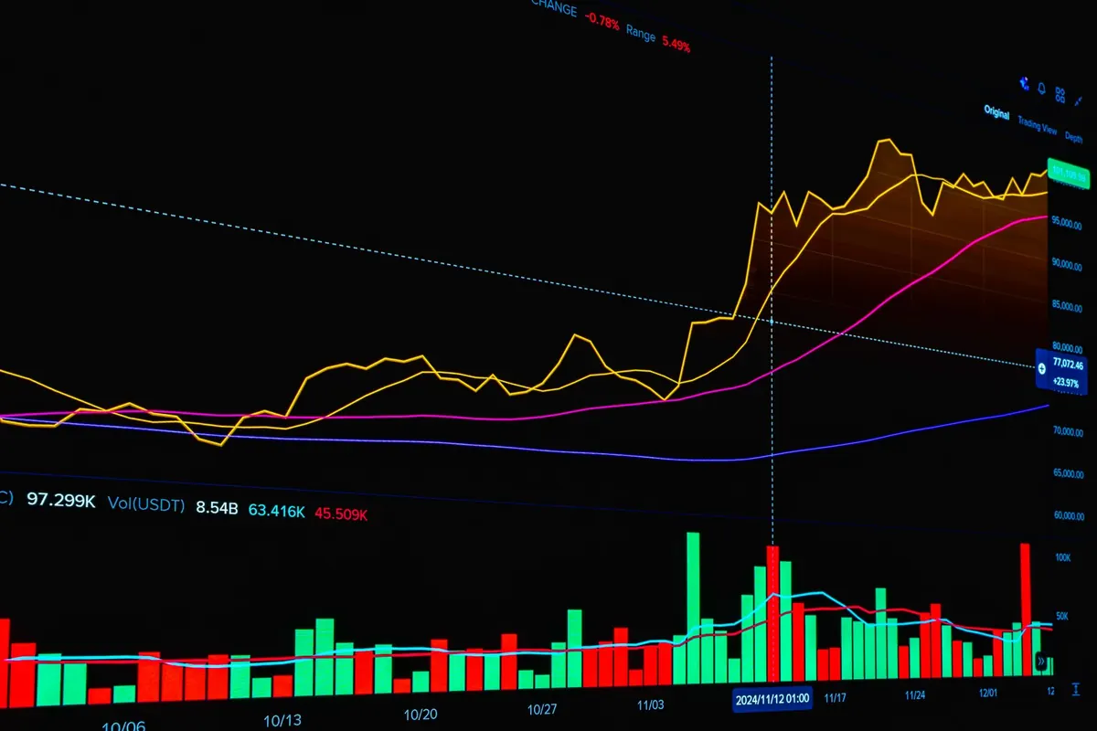
The chart is finished. The headline is sharp. And somewhere in a spreadsheet, a cell still holds a number nobody has checked twice. Most data corrections do not come from bad intent; they come from a rushed afternoon, a mislabelled column, a percentage built on the wrong base. A checklist will not make a story brilliant. It will keep it honest — and keep you out of the corrections column. Here are ten checks, grouped into the three places mistakes usually hide.
Validation: prove the data before you write
Validation is the unglamorous part: reopening the raw file, ignoring your own notes, and rebuilding the number from scratch while you still have time to be wrong. Do it before the draft exists, not after an editor asks.
- Point 1: Trace every figure to its origin. Not to the summary document, and not to the spreadsheet someone emailed you. Open the source file, find the row, and confirm it says what you think it says. If the trail stops at a screenshot, you do not have a source yet.
- Point 2: Rebuild the key number by hand. Whatever the pivot table, formula or script produced, recalculate one case with a calculator. If the manual result and the automated result disagree, that disagreement is the first thing to solve.
- Point 3: Interrogate the denominator. A count means little without the population behind it. Ten incidents in a city of 40,000 is a different story from ten in a city of four million — and a rate per 100,000 is only honest if you use the same population definition for every year you compare.
- Point 4: Ask what is missing. Datasets rarely announce what they left out. Suppressed values, duplicate records, categories merged for privacy, people who never appear because they never report: each one bends the conclusion. Write a short note about the gaps and keep it for the piece.
Watch the usual suspects: totals that do not add up because of duplicates, a "percentage" that is actually a count, rounded figures that sum to 103, dates stored as text, comma decimal separators. Define every term in a note to yourself — "complaint", "active user", "serious injury" — because the source's definition may differ from the one your readers assume.
If you cannot explain in one sentence how a number was produced, you are not ready to publish it.
Visualisation: make the chart tell the truth
A chart can be accurate and still mislead. The failures are rarely exotic; they are axis tricks, overloaded colour and a chart type chosen out of habit rather than purpose.
- Point 5: Start bars at zero. Bar length carries the comparison, so a truncated axis turns a two-point gap into a cliff. Line charts may use a narrower range when change matters more than magnitude — but say so on the axis.
- Point 6: Match the chart to the question. Lines for change over time, bars for comparison between categories, scatter plots for relationships. With more than four or five categories, ask whether a sorted bar chart or a plain table would serve readers better than a colourful pie.
- Point 7: Label directly and cut decoration. Put names beside the lines they belong to, state the unit once, and delete the shadows, gradients and gridlines that add noise. Not everyone sees colour the way you do, so never let red and green carry meaning on their own.
Read your chart out loud
Describe each visual in one spoken sentence: "Spending rose in every region except the north, where it fell after 2019." If that sentence is false, contorted, or only works with the caption attached, the chart needs work — not a better caption.
Ethics: ask who could be harmed
Accuracy is the floor, not the ceiling. Ethical questions tend to arrive late, usually the night before publication, so build them into the process instead.
- Point 8: Protect the smallest group you expose. Small counts can identify real people, especially combined with indirect clues such as a job title, a town or a rare condition. Aggregate, round or omit before you publish — and check whether your source already did.
- Point 9: Separate what the data shows from what you believe it means. "Linked to", "associated with" and "occurred alongside" are usually safer than "caused" unless the method genuinely supports a causal claim. Correlation, self-reported figures and small samples all limit what one story can say.
- Point 10: Give people a fair chance to answer, and publish the limits. Contact the subjects of your analysis, note the methodology, sample size and uncertainty, and say who funded or collected the data. Transparency belongs in the middle of the story, not in a footnote.
If a story touches health, money or legal outcomes, have someone qualified read the interpretation before it goes out, and tell readers plainly what the data cannot say about their own situation.
A twenty-minute pre-publish pass
Before you hit publish, read the piece once as though you were hunting for a reason to doubt it.
- Check every number in the body, the chart, the caption and the headline — they drift apart during edits, and the headline is usually where the overstatement lives.
- Confirm names, dates, units and currency, and make sure percentages and percentage points are not used interchangeably.
- Re-read the lead: does its claim survive the weakest point in your data?
- Save a dated copy of the dataset, your calculations and your notes on definitions, so a correction takes minutes rather than days.
- Leave a contact route for readers who spot something wrong.
Corrections happen to careful people. The difference is that careful people find their own errors first. Publish when you can defend every figure — not when you are tired of checking.