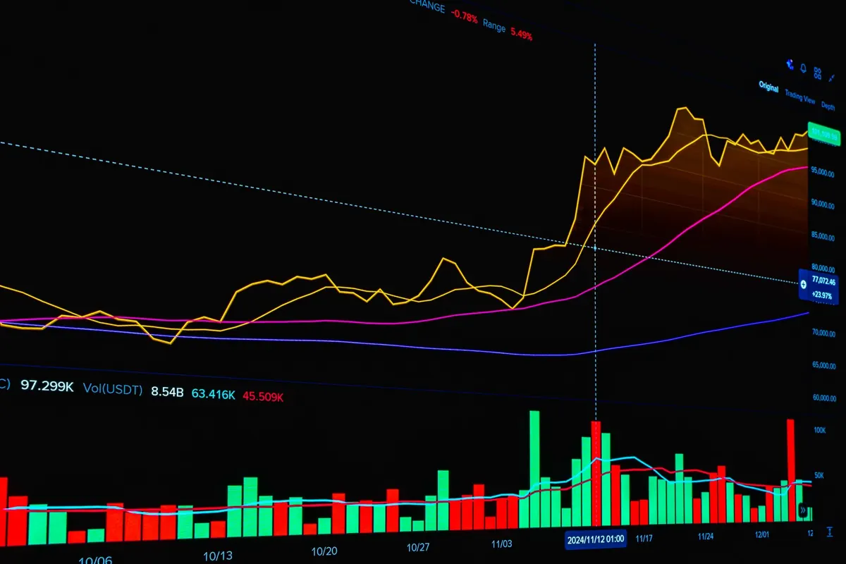
A report tells you what happened yesterday. A live dashboard tells you what is happening while you can still do something about it.
For a newsroom, that difference is everything. If a story is climbing at 9:40 a.m., an editor can move it to the homepage, push it into a newsletter, or commission a follow-up before the spike is over. The hard part is not the charts. It is the plumbing underneath them, and the discipline to keep the screen readable.
Start With the Questions, Not the Charts
Before you compare chart libraries, write down the three questions your dashboard has to answer every minute. For most newsrooms they are: which articles are being read right now, where those readers are arriving from, and which stories are actually holding attention rather than just collecting clicks.
Anything that does not answer one of those questions belongs in a weekly report, not on a live screen. Ten metrics attract attention; three drive decisions.
Step 1: Agree on What "Real Time" Means
Live for a breaking-news desk is not the same as live for a features section. A refresh every 10 to 15 seconds is plenty for editors watching a homepage; a 60-second refresh is fine for a newsletter team working in the morning. Write the interval down before you build, because it shapes every choice that follows.
Next, define your events. Each one needs a stable name and a small, fixed schema so that a change in the front end does not quietly break your numbers. A workable starting set:
- article_view — article ID, section, referrer, device class, country
- engaged_read — fired once per session when a reader passes 25 seconds or 50% scroll depth
- scroll_complete — reached the end of the piece
- share_click — platform and placement
- newsletter_signup — the form or module that converted
- outbound_click — where readers left you
Keep every timestamp in UTC. Generate an anonymous session ID that rotates daily. Filter obvious crawlers at ingestion rather than later, because bots distort every ratio on the screen and someone will eventually make a decision based on a fake traffic spike.
Step 2: Collect Events Without Slowing the Page
The tracker should be tiny and non-blocking. Send events with navigator.sendBeacon or a keepalive fetch so a page unload does not swallow them, and wrap the whole thing so that an analytics failure can never break rendering. Readers will not forgive a slow article because your dashboard wanted another data point.
On the server side, write events to a queue before you write them anywhere else. At modest traffic, a Redis stream or a Postgres table with a background worker is enough. At news scale — election night, a transfer deadline, a storm — a log-based broker such as Kafka, Redpanda or Kinesis absorbs the burst so your database does not take the hit.
Sample when you have to. At very high volume, keep 100% of engaged reads and sample raw pageviews, then scale the estimates. Consistency beats precision here: a dashboard that moves in the same direction as reality is more useful than one that is exact but arrives twenty minutes late.
Step 3: Pick a Store That Likes Append-Only Data
Live analytics is a write-heavy, append-only problem, and a database designed for transactions will fight you. Choose by volume, not by fashion.
Rough sizing guide
- Under a few million events a day: Postgres with partitioned tables, plus Redis sorted sets for counters.
- Tens of millions a day: a columnar time-series store such as ClickHouse, Druid or TimescaleDB.
- Already in a warehouse: stream micro-batches into BigQuery or Snowflake and query it there.
Whatever you choose, maintain rollups. Precompute counts per article per minute and per five minutes. The dashboard then reads a few hundred rows instead of scanning millions of events, and the page stays fast a year from now when the volume is ten times larger.
The fastest dashboard is the one that never touches raw events.
Step 4: Design a Screen You Can Read in Ten Seconds
Layout matters more than tooling at this stage. The screen should answer one question at a glance: what changed?
- Top strip: four numbers for the last 15 minutes — active readers, articles viewed, engaged-read rate, median time to first scroll.
- Main table: your top 20 articles with views, engaged reads and a sparkline of the last hour. Compare each article against its own baseline, not against a site-wide average.
- Side column: traffic sources split into search, social, direct, newsletter and internal.
- Bottom: a short feed of threshold crossings, so nobody has to stare at the screen waiting.
Common mistakes
- Pie charts with nine slices nobody can compare.
- Absolute numbers with no denominator, so a small section looks like a failure next to a huge one.
- Per-article averages computed over unequal windows.
- Auto-refresh so aggressive that reading the screen is impossible.
Always show a "last updated" stamp. If the pipeline lags, say so instead of presenting stale numbers as fresh. Trust in the screen is worth more than the extra two seconds of latency you saved.
Step 5: Add Alerts, Then Prune Ruthlessly
Views are passive. Alerts are active. A handful of rules covers most newsroom needs: an article takes five times its section's median views in the first ten minutes; the engaged-read rate on a promoted story falls below half the site median; a single referral source jumps. Route them to Slack or email, and cap them at one per article per hour so the channel stays readable.
Then review the dashboard the way you would review any product. Every few weeks, check what editors actually open and click. Delete what they ignore, even if it took a week to build. Add a metric when the same question keeps coming up in the morning meeting. A dashboard with twenty panels that nobody reads is worse than four numbers that everyone trusts.
Keep It Small, and Keep It Honest
Start with one screen and four metrics: active readers, top articles, engaged-read rate, traffic sources. Ship it, watch how people use it, and add a panel only when you can name the decision it supports.
Two habits will keep the project alive. First, treat the pipeline as production infrastructure — monitor ingestion, alert on gaps, and test after every deploy. Second, stay conservative with what you collect. Aggregate rather than identify, avoid anything you do not need, and check with whoever owns privacy and consent at your organisation before launch, since the rules differ by jurisdiction and by what readers agreed to. A dashboard built on data people did not consent to is a liability, not an asset.
Photo: Lalmch / Pixabay